Showing posts with label Jersey Analysis. Show all posts

Friday, March 9, 2018

Daredevils unveil new kits for 2018

Delhi Daredevils have unveiled their new strips for the new season which actually lacks anything that's 'new'. The quality of the design has been declining season to season for DD and this year is not an exception. Starting the IPL in 2008 with one of the best attires, the GMR owned team has gradually minimized all its efforts on the visual aspects of the playing clothing leading to this season's (so far) pathetic jersey as seen below.
Players pose with the 2018 Delhi Daredevils jersey
Sports goods manufacturer Shiv-Naresh has probably ended its deal with DD and the current manufacturer for the playing kits is unknown as of now. The design is repetitive with no changes to the base of past few years' jerseys. The collar part is changed, making the jersey look poorer.

'Daikin' has continued its association with DD and their logo dons the central part of the jersey. 'Jio Telecom' also continues to sponsor DD in some capacity and the logo which is now changed to blue from last year's red, rests on the upper leading arm instead of last year's right chest while the IPL logo sits on the lower leading arm. The franchise owner GMR Holdings have decided to show off their own logo on the lower non-leading arm while the upper slot on the non-leading arm remains empty as of now.

New sponsor 'Suzuki Gixxer' has been awkwardly placed on the right chest while the newly simplified 'DD' logo of the team is placed on the usual left part of the chest. Another new sponsor, Cargill India's brand 'Nature Fresh' is prominently displayed on the back of the jersey.

Gautam Gambhir, the newly announced skipper of DD
Brand Cricket Verdict: The jersey could have been loads better in my opinion. Sticking to the same base design (though not being liked by many) is not a good approach. The oldest black and red jersey by Adidas still remains my favorite for DD. Cricket teams should basically root on symmetric jersey designs rather than asymmetric ones like this one.

Brand Cricket Jersey Score: 4 on 10

Stay tuned for more updates on all IPL jerseys for 2018.

Update (13th March 2018): The kit manufacturer is learnt to be T10 sports, the same company that made kits for Delhi Daredevils last year. Here is a tweet from the manufacturer.

Friday, February 2, 2018

CSK's possible 'new' attire for 2018

CSK has returned to the IPL after two years and has 'retained'... yes, you guessed it! The jersey design. The most consistent element in the IPL so far are the batsman insignia in the IPL logo and CSK's jersey design. The yellow jersey which has been the same from since forever has returned with some new sponsors with the main one being 'The Muthoot Group' which has replaced Aircel's 8-year-long spot on the belly. The mock-up for the 'new' jersey has been posted by the twitter handle of 'Equitas Small Finance Bank' and it looks like this.


The above mock-up might not be completely true to what the final jersey would be; we might see a change in the design (which we hope every season) depending on what the CSK management decides.

With reference to this jersey shown, the following are the sponsors that claim the real estate on the clothing:
  • The Muthoot Group (Belly)
  • Gulf Oil (Right Chest)
  • Equitas Small Finance Bank (Upper Leading Arm)
  • Hyderabad Industries Limited (Upper Non-Leading Arm)
  • Nippon Paints (Lower Non-Leading Arm)
  • India Cements (Back)
If my assumption is correct, Spartan will be back to continue its association with CSK for manufacturing the official kits. M S Dhoni's own 'Seven' brand (which is supported by Spartan) might be labelled as the official kit supplier for CSK in 2018. 

Stay tuned for more updates on all IPL jerseys for 2018. Exclusive info on RCB jersey to follow soon!

Original Tweet:

Sunday, February 21, 2016

Jersey Analysis: Orange, Blue and the Gujarat Lions!

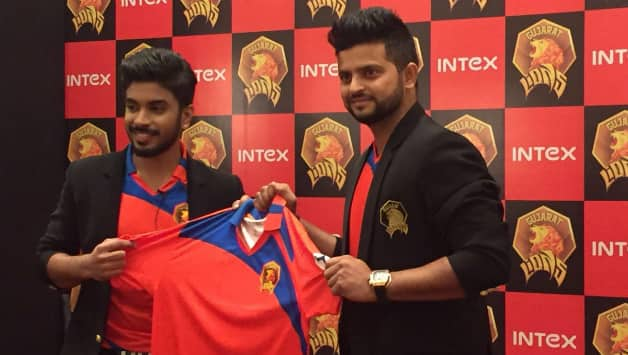
The Rajkot based franchise, Gujarat Lions unveiled their official apparel, with an expected Saffron to don the major portion. However, blue was a surprise. Keshav Bansal who owns the franchise and Suresh Raina, the ace player from the defunct CSK who is to captain the Lions, released the jerseys. As with the case of RPSG, the photographs lied here too, making people think the orange was red.

The photograph that lies!
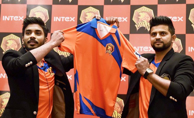
The actual colour that makes the larger portion of Gujarat Lions apparel is orange (or saffron according to few) which was an anticipated move. The surprise element was the inclusion of the royal-blue design elements on the jersey. A tweet from Gujarat Lions said "So here's what Keshav Bansal & team thought while the jersey was being finalised: The Orange represents boldness & Blue stands for depth!" I don't really understand what role does 'depth' play here.

This is the Orange that actually looks like Orange!
The Jersey Analysis

The jersey looks very average in design. The kit-maker is unknown as of now and the design is very basic. There appears to be the manufacturer label beneath the collar but there are no photos with such clarity to identify it. Only assurance is that it's not from any big player in the industry.

Entire jersey is orange, with a spinning razor-like spark of blue both front and back. This photo of Keshav Bansal reveals further aspects of the design.


The jersey has no piping for collar and arms. The collar isn't separated from the design of the jersey as the design elements extend on the collar. The logo is placed well on the left chest part of the jersey. The colour for name and number at the back are revealed by the image above to be the same blue used in the design of jersey. A white score or the outline would have made the letters and numbers more visible.

As with the case of RPSG, the GL too, have made the initial release of their jersey and only the IPL logo is present on the shirt. Lots of real estate needs to be claimed on this jersey too and I expect Intex to be the belly sticker. We should wait for the rest to be known.

The Verdict

The logo of the team is actually a better design compared to most teams of IPL. If the jersey complemented the logo, it would have been even better. Based on their promotional images and logo design, I was expecting gold and shades of yellow on the jersey of GL which could have made the jersey more likeable. I would rate this jersey 5 on 10.

Tell me. Are those ours?


Jersey Analysis: Rising Pune Supergiants' Cocktail Jersey!

The RSPG as they acronym themselves unveiled the cocktail jersey brewing the RCB, KKR and the defunct CSK jerseys together. MS Dhoni, the current captain of RSPG who still misses CSK and Sanjiv Goenka, the chairman of New Rising group unveiled the multicoloured jersey. This news is old and you all might already have read it. And this blog is now dissecting the details.

This is the jersey most of you have seen.
The social media states that the jersey is a blend of three other teams, I actually do not agree with this. Reason being people just comment seeing the red of RCB, purple of KKR and yellow of CSK in the jersey that they have seen. However, this is not the case! I'd like to suggest you to have a look at the logo of RP-SG Group. RP-SG is not the team name, it is 'RP - Sanjiv Goenka' Group.


That you see above, is the logo of RP-SG Group that owns the RPSG Team. The team name, though criticized for its unusual name and logo, is a clever move from Mr. Goenka. The logo contains shades of yellow, orange, pink and purple and this has been implemented on the jersey design as well. The same was also incorporated on the team logo which I consider, the worst logo for any IPL team so far.

And again, the jersey has no red shade. The lighting in the photos misguide people. Courtesy of Firstpost, I present you the photo which shows the actual colours and gradients used in the jersey.

This is the jersey which actually shows the true colours!

The Jersey Analysis

The designer for this jersey is still unknown. There is a black collar label which only specifies the size 'L' and no jersey manufacturer logo. Even the design language doesn't indicate any well-known kit-maker. 

The arms gradient from pink to purple to navy blue reaching the elbow region; also lower belly region, Dark shade of pink is predominant, apparently the back region also duplicates the front design. A small piece of yellowish-orange makes an appearance on the jersey. The collar is navy blue with the yellowish-orange piping, similar piping is also used for arms. The colours for the number and name on the back is unknown as of now, I predict it to be yellow or white.

Being the initial release, the jersey has lots of unclaimed sponsor spaces with only the team logo on the left chest and the tournament logo on the arm printed at the time of unveiling. I have no other predictions for the sponsors except the RP-SG Group donning the belly space on the jersey. The official website still doesn't list any sponsors and we can only know them once the team catches up for practice sessions or when they are finally on the field playing their first match.

The Verdict

Though I feel this team's logo is crap, the jersey balances the crappiness of the logo by employing a bold look. The jersey is different and unique, with the inclusion of pink for the first time in IPL. I feel the yellow patch was not required in the design. Overall, the jersey can be rated 6 on the scale of 10.