Thursday, March 31, 2016

The Royal Attire - Episode 4 : 2011

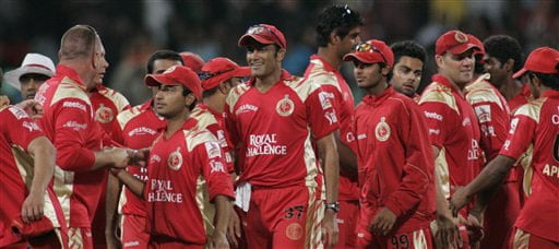
The design language adopted for 2011 season of the DLF Indian Premier League was a total overhaul on the previous designs. An addition of tertiary blue colour was the highlight of this new design. Reebok continued to manufacture the attire for the team.


The base was the usual red. The ratio for the secondary colour gold on the jersey was increased largeley, extending to the sleeves. A red piping was used on the sleeves. A portion of blue was introduced on the shoulders and sides. Numbering was made blue with a whit outline and the names were printed in blue too.

'McDowell's No.1' was featured on the belly and 'Royal Challenege' was put on the back. For initial few matches, the McDowell's logo appared in two lines, later was changed to appear in a single line. The chest logos were the same as the two previous seasons. The kingfisher logo on the sleeves was put with the transparent background for this season. The manufacturer and the tournament logo were black. A new sponsor, 'White Mischief Vodka' was given a place on the sleeve.
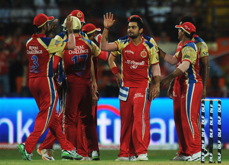
Team RCB in 2011.
RCB launched an environmental campaign 'Game for Green' in this season and would wear a green jersey in support of this for one match of the season. This green jersey was all the same as that of the normal jersey, only red being replaced with green and inclusion of a specially made 'Game for Green' logo.


The usage of gold colour for names and numbers, white for sponsor logos on the light green base reduced the visibility greatly. No steps were taken to avoid this.

Team RCB in 'Game for Green' match in 2011.
RCB used the same jersey again for the Nokia Champions League Twenty20 season of 2011 with changes in font and tournament logo.


Nothing much changed for next season. Still, there are few things to be known. Stay tuned!

The Royal Attire - Episode 3 : 2010

Here is the next installment of the series. I present the jerseys RCB used in the DLF Indian Premier League 2010 in this post. Nothing much was changed from the previous look of the jersey.


Only two things were changed, the main red colour was slightly lightened and the back, 'McDowell's No.1' was advertised in the place of previous year's 'Royal Challenge'. A little addition was made in the form of two blue stripes beneath the name of the player at the back of the jersey. Everything else remained the same. The number requirement on the trouser was removed this season onwards.

The RCB team in 2010.
RCB used an almost similar jersey for the Airtel Champions League Twenty20 2010 which was held in South Africa. The major change was the collar, where the traditional red one was replaced by a more futuristic gold collar. Everything else was the same except for the tournament logo and the font used for names and number.


Next season saw a brand new jersey with an introduction of a tertiary colour. Stay tuned to know more!

Exclusive: Lloyd and Tata Zest are the new Associate Sponsors for RCB

The image you see below is taken from a twitter post from the official account of Lloyd Electronics. Through this, they have announced themselves as the associate sponsors for RCB this season.

If the image is examined, it reveals several other things. The placement of the new RCB logo, Lloyd logo on chest. Huawei's Honor brand, as expected by me on the belly. Also found is the new 'Tata Motos Zest' logo on the sleeve. This means Tata Motors continue to be associate sponsors through the new 'Zest' replacing the previous years' 'Bolt'. The jersey design is old and being used as a placeholder.

Here is the tweet:

The RCB Jersey Prediction for 2016

As an RCB enthusiast, I take an opportunity to predict the RCB jersey for the 2016 season. Adidas would be manufacturing kits for RCB again in 2016. The signature 'three-stripes' was not present on the 2015 jerseys, however, I expect this to be a part of the design language implemented for 2016. I hope the collars would be non-traditional and look as below. For some reason, I expect Huawei's 'Honor' brand to be advertised on the belly this year. There might be new sponsors this time too.

The design you see below (Version 1) was the initial design I had made before RCB unveied their new logo and VIVO was unveiled as the title sponsor for IPL. I redesigned this after these two announcements were made. I somehwat believe that RCB is ditching out the blue colour from its jersey. I made the blue part black in my redsign which you see below (Version 2).

Version 1

Version 2
What do you think? Will the official jersey be similar to this prediction? Only time will tell!

The Royal Attire - Episode 2 : 2009

I took a quite long to write this episode as I was busy with few other things I had to do. Here is the second installment of the series I started in February. Presenting you the second attire RCB wore, for the DLF Indian Premier League of 2009.


So much was changed in this season. The yellow was completely removed and replaced with gold as a secondary colour. The logo was slightly changed too, with the replacement of yellow with gold and addition of a white dotted circle around the RC emblem.

Reebok continued to manufacture kits for RCB. A major change in this season was interchanging the name and number order which was common for every team. The names of the players from this season onwards appeared below the number and space above the number was used for advertising. For this jersey, numbers were printed in black again, names were changed to white from yellow. A gold outline was added to the numbers. The mandatory requirement of numbers on trousers was present for this season too, however, this was the last season with such requirement. This was similar to the jerseys as well.

The RCB team in 2009.
The kit manufacturer logo was pushed to sleeves from this season and a secondary sponsor logo acquired the right chest space. The team logo consumed the usual left chest space. The right chest showed the 'Whyte & McKay' logo, sleeves had the mandatory tournament logo which was white this time instead of previous year's black version and other UB brands associated with Mallya. These were 'Kingfisher Premium' and 'McDowell's No.1'. The real estate on the belly and the back were donned by 'Royal Challenge'.


The same jersey was used in the Airtel Champions League Twenty20 2009 with only change in the tournament logo and the font used for name and number on jerseys as per the regulations of CLT20. The gold outline on the numbers seen in IPL version of the jersey was removed.

This jersey design was maintained for two seasons, with the next (2010) witnessing the usage of a very similar jersey. Read about that in the next episode!

Friday, March 11, 2016

Exclusive: RCB's new logo is here!

Brand Cricket Blog broke the exclusive news of RCB changing the logo for this season of the VIVO Indian Premier League a while ago. Today, I present you the new RCB logo being used from 2016. Here it is!
The new RCB logo!
So much has changed in the logo, with the colour blue completely ditched out of the theme. The lion is bigger and there are no gradients anywhere in the logo. RC emblem is changed, has a lighter gold shade while the main ring and the lion have darker gold. The colour black dominates over red. I feel usage of gradients could have bettered the logo. Read more about the logo analysis here.