Friday, February 26, 2016

News: Mallya quits USL, becomes RCB's mentor.

The king of good times, Dr. Vijay Mallya has stepped down as the chief of United Spirits Ltd., yesterday. This is all over the news and you can read about the reasons and more here: Times of India, The Hindu, The Economic Times

With this resignation from boards of all USL group firms, Mallya is no longer in a position to control the Royal Challengers Bangalore. However, his son Sidharth Mallya will be the director of the firm that runs RCB (for at least two years), while Mallya has announced to don a new role as RCB's chief mentor.


For RCB fans, this wasn't a welcome move as the respect for Vijay Mallya was same as that for RCB. These happenings confirm a plethora of changes on the outlook of RCB from 2016 season. We have to wait to witness the changes!

Wednesday, February 24, 2016

The Royal Attire - Episode 1 : 2008

'The Royal Attire' series will focus on the evolution of RCB's apparel from its debut in 2008. Here is an illustration of the first jersey RCB donned in first season of the DLF Indian Premier League.


The jerseys for the first season strongly resembled the flag of Karnataka, the state where the franchise is based from. Red became the predominant colour for RCB, yellow being the secondary colour. Rahul Dravid was the captain of RCB then, The bright usage of colours and gradients made the jersey rank top among the favourites.

Reebok manufactured the kits for RCB in the first season of IPL. Almost all advertising real estate on the jersey was used up by Vijay Mallya's brands - 'Royal Challenge' both on the belly and the back, 'Kingfisher Premium' and 'Royal Challenge' again, on the sleeves. The player names were printed in yellow while the numbers were black, with a yellow score. In my opinion, the usage of black was unwanted as it nowhere related to the jersey design. It was also mandatory to put the player numbers on the trousers in this season. These were also similar to the numbers on the jersey. The batting and keeping gear including helmets leg guards used by RCB players were red.

The mandatorily placed tournament logo was all-black however, some teams preferred usage of the coloured logo on a white patch. This was the only black thing other than the player numbers. RCB's crest was placed on the left chest and Reebok logo was present on the right side of the chest.

Rahul Dravid as RCB Skipper in 2008
It should be noted that Reebok who had just rebranded themselves, publicly unveiled their new logo with IPL 2008 by sponsoring 4 teams: RCB, Chennai Super Kings, Kolkata Knight Riders and Rajasthan Royals. During this season, RCB's logo was very different compared to future seasons. The logo had a vibrant yellow (which was later replaced by gold) and the RC emblem was very basic.

The next season saw major changes and I shall be revealing them soon. Stay tuned for the next episode!

Monday, February 22, 2016

Exclusive: RCB changes logo for IPL 2016.

Headed to the official IPL website recently? If not, go there now! If you are an RCB fan and a brand enthusiast, you'll see something changed in the RCB's team page on the website. It is, the new logo, not available anywhere officially, making an appearance on the IPL website. So this is official and RCB has changed the logo for the 2016 season.

Here is the link to the RCB page on the IPL website: Click!


The logo you see above is the maximum resolution image available as of now. The new logo majorly resembles the previous season's social media campaign '#PlayBold' promotional images and the newly rebranded 'Royal Challenge Whiskey' logo. 

The rebranded Royal Challenge Whiskey
The major change is the absence of the crown and the blue shield which contained the lion inside. The lion is now released from the shield, has become massive, outsizes the 'RC' emblem on the logo. The text "Royal Challengers Bangalore" is now a single line which was split in the old logo. The 'RC' logo is slightly changed too, matching the rebranded 'Royal Challenge' emblem on the liquor brand. 

I feel the thick black outer circle surrounding the RC emblem was not necessary. However, this might be a sign of total integration of the team logo with the liquor brand. Another important thing to notice is that the logo has got rid of any traces of the colour blue. This might also be an indication that the team jersey is getting rid of blue too. 

I predict that RCB will be adopting a home and away system and sporting two different jerseys along with the 'Game for Green' jersey. We might be seeing the red-gold-black jerseys for RCB this time! Only the time will tell! 

Sunday, February 21, 2016

Jersey Analysis: Orange, Blue and the Gujarat Lions!

The Rajkot based franchise, Gujarat Lions unveiled their official apparel, with an expected Saffron to don the major portion. However, blue was a surprise. Keshav Bansal who owns the franchise and Suresh Raina, the ace player from the defunct CSK who is to captain the Lions, released the jerseys. As with the case of RPSG, the photographs lied here too, making people think the orange was red.

The photograph that lies!
The actual colour that makes the larger portion of Gujarat Lions apparel is orange (or saffron according to few) which was an anticipated move. The surprise element was the inclusion of the royal-blue design elements on the jersey. A tweet from Gujarat Lions said "So here's what Keshav Bansal & team thought while the jersey was being finalised: The Orange represents boldness & Blue stands for depth!" I don't really understand what role does 'depth' play here.

This is the Orange that actually looks like Orange!
The Jersey Analysis

The jersey looks very average in design. The kit-maker is unknown as of now and the design is very basic. There appears to be the manufacturer label beneath the collar but there are no photos with such clarity to identify it. Only assurance is that it's not from any big player in the industry.

Entire jersey is orange, with a spinning razor-like spark of blue both front and back. This photo of Keshav Bansal reveals further aspects of the design.


The jersey has no piping for collar and arms. The collar isn't separated from the design of the jersey as the design elements extend on the collar. The logo is placed well on the left chest part of the jersey. The colour for name and number at the back are revealed by the image above to be the same blue used in the design of jersey. A white score or the outline would have made the letters and numbers more visible.

As with the case of RPSG, the GL too, have made the initial release of their jersey and only the IPL logo is present on the shirt. Lots of real estate needs to be claimed on this jersey too and I expect Intex to be the belly sticker. We should wait for the rest to be known.

The Verdict

The logo of the team is actually a better design compared to most teams of IPL. If the jersey complemented the logo, it would have been even better. Based on their promotional images and logo design, I was expecting gold and shades of yellow on the jersey of GL which could have made the jersey more likeable. I would rate this jersey 5 on 10.

Tell me. Are those ours?


Jersey Analysis: Rising Pune Supergiants' Cocktail Jersey!

The RSPG as they acronym themselves unveiled the cocktail jersey brewing the RCB, KKR and the defunct CSK jerseys together. MS Dhoni, the current captain of RSPG who still misses CSK and Sanjiv Goenka, the chairman of New Rising group unveiled the multicoloured jersey. This news is old and you all might already have read it. And this blog is now dissecting the details.

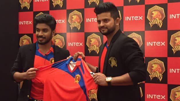
This is the jersey most of you have seen.
The social media states that the jersey is a blend of three other teams, I actually do not agree with this. Reason being people just comment seeing the red of RCB, purple of KKR and yellow of CSK in the jersey that they have seen. However, this is not the case! I'd like to suggest you to have a look at the logo of RP-SG Group. RP-SG is not the team name, it is 'RP - Sanjiv Goenka' Group.


That you see above, is the logo of RP-SG Group that owns the RPSG Team. The team name, though criticized for its unusual name and logo, is a clever move from Mr. Goenka. The logo contains shades of yellow, orange, pink and purple and this has been implemented on the jersey design as well. The same was also incorporated on the team logo which I consider, the worst logo for any IPL team so far.

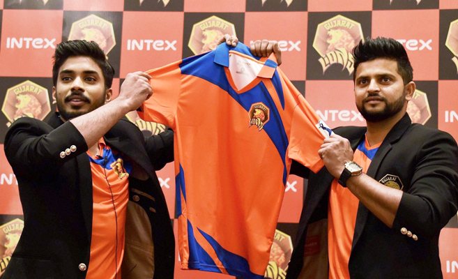
And again, the jersey has no red shade. The lighting in the photos misguide people. Courtesy of Firstpost, I present you the photo which shows the actual colours and gradients used in the jersey.

This is the jersey which actually shows the true colours!

The Jersey Analysis

The designer for this jersey is still unknown. There is a black collar label which only specifies the size 'L' and no jersey manufacturer logo. Even the design language doesn't indicate any well-known kit-maker. 

The arms gradient from pink to purple to navy blue reaching the elbow region; also lower belly region, Dark shade of pink is predominant, apparently the back region also duplicates the front design. A small piece of yellowish-orange makes an appearance on the jersey. The collar is navy blue with the yellowish-orange piping, similar piping is also used for arms. The colours for the number and name on the back is unknown as of now, I predict it to be yellow or white.

Being the initial release, the jersey has lots of unclaimed sponsor spaces with only the team logo on the left chest and the tournament logo on the arm printed at the time of unveiling. I have no other predictions for the sponsors except the RP-SG Group donning the belly space on the jersey. The official website still doesn't list any sponsors and we can only know them once the team catches up for practice sessions or when they are finally on the field playing their first match.

The Verdict

Though I feel this team's logo is crap, the jersey balances the crappiness of the logo by employing a bold look. The jersey is different and unique, with the inclusion of pink for the first time in IPL. I feel the yellow patch was not required in the design. Overall, the jersey can be rated 6 on the scale of 10.


Brand Cricket, the blog!

Firstly, hello to everybody, I'm Akshay. I'm a cricket enthusiast, branding and identity expert. I have been an ardent fan of cricket, domestic leagues and franchises that take part in these highly anticipated cricketing events. I'm a die-hard fan of Royal Challengers Bangalore team that plays in the Indian Premier League. The reason this blog was created is to shed the focus on the aspects that most sports blogs, fan pages, news sites or the official websites fail to cover. The blog aims to show the readers, generally, what they see! That is the branding of the teams or leagues, the apparel and identity that build the brand for these entities. I shall be writing on topics like the evolution of branding on the jerseys, the logos and so on in this blog. To start, I shall be concentrating on my favorite team, the RCB and explaining the evolution of RCB Jersey from 2008. Also, I shall be covering the jersey launches from 2016 edition of the IPL in a separate 'News' section. Follow the blog, for more updates!