Showing posts with label IPL 2016. Show all posts

Friday, April 29, 2016

A New Livery for the Royal Attire! (Episode 9 : 2016)

The new season is here and everything about RCB looks very fresh and new too! Firstly, my apologies that I kept you waiting this long. Though I had wished to write about RCB’s visual treats for 2016 long ago, few of my commitments hijacked my blogging time. Anyways, here is the much-awaited episode of the RCB Jersey Evolution!

My blog had previously tried to figure out what the jersey would look like for this season of the IPL and many of my predictions did not come true. However, those which actually turned out to be true were the introduction of ‘Home’ and ‘Away’ system with two separate jerseys and the placement of few sponsor logos.

The Jersey Launch
This season will witness maximum changes on the RCB jersey compared to the previous ones. Adidas is no longer the kitmaker for RCB and it has been replaced by Zeven, a newcomer to the arena. Zeven is a sports goods manufacturer with the greats like Mahesh Bhupathi and Ravi Shastri in its corporate unit.

The jerseys have a totally refreshing look with black and red donning the maximum area. Gold has been used only for piping and blue has been completely eliminated. This new look has been designed by Michael Foley, well-known among the sportswear designers. The home and away jerseys swap primary and secondary colours excepting the collar which remains same for both. Interestingly, the sides beneath the arms and the extended patching on the trousers with the black design on home apparel turn grey on the away strips, not red. The names and numbers for the players are printed in gold, which is the only gold-dominant area, unlike previous designs.

THE HOME JERSEY
THE AWAY JERSEY
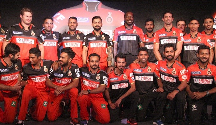
Moving to the commercial part, Huawei which rested on the belly spot has gone and has been replaced by Hero Cycles. I am not a fan of the white background this logo contains. I feel the logo should’ve been white with no background. The chest area is held by Lloyd Air Conditioners, another newbie to the RCB family. Britannia and Tata Motors (now as Zest) continue to place themselves on the sleeves while LYF Smartphones is another new addition on the sleeve. Kingfisher, as usual, dons the back but has nothing below it unlike previous seasons’ ‘Packaged Drinking Water’ (2014) and ‘Premium’ (2015). Few players do not endorse the liquor brand due to religious reasons however, packaged drinking water would’ve avoided this! The jersey maker Zeven and 7UP are seen on trousers while Acer and Himalaya Mens’ (initially ‘Pimple?’) are placed on the headgear.

Team RCB in 2016.
EDIT: SUNDAY, MAY 15, 2016
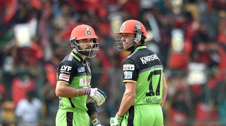
The 'Game for Green' jersey wasn't very different except for the primary colour being green. The only change was the usage of black colour for name and numbers instead of the usual gold. As always, twitter handles of the players were used in the place of names at the back. The team used did not use the green caps for unknown reasons and played with usual red caps. The batting and keeping gear was red as opposed to previous seasons' gold variants.


This season's green match was an absolute blinder with numerous unforgettable moments. The dangerous duo of Ab deVilliers and Virat Kohli scoring centuries each and RCB winning the match with a mammoth run margin.

The heroes of the RCB's Go Green match of 2016.
Stay tuned for a new series on Indian Jerseys!

Thursday, April 7, 2016

Huawei out, Nags returns and a #Bold Prediction!

Tomorrow is the official launch of the RCB Jersey for 2016. However, I am here to provide a final update on the prediction. It appears that Honor or Huawei may have discontinued their sponsorship deal and might not get featured on the jerseys. The footer on the RCB website which displays the sponsors do not show Huawei. Hero Cycles is listed next to the USL which means, they are the principal sponsors. It also makes me think they have reserved their spot on the jerseys.

Meanwhile, Mr.Nags has come back to RCB camp and here is the first video if the 'Insider' series for 2016.


The video blurs out the previous sponsors, thus clearing that they aren't being a part of the RCB family this year. Notice the blurring of Huawei on Nags' jersey.

Also, in this tweet by RCB, the sponsor logos on the jersey have been photoshopped and removed.
The Final Prediction
This is my final prediction before the official launch of the jersey. There is a possibility that Kingfisher would still be at the back and 'Acer Computers' might take the place of 'LYF Smartphones' on the sleeves as seen below. Most of the other things might be same.

A bold prediction!
What do you think? Would my design be close to the official one? Will I be surprised? I'll reveal it within next 24 hours! Stay tuned!

Wednesday, April 6, 2016

The fresh new batch of sponsors for 2016

The new team of sponsors have been listed on the official website of RCB and they are as follows.
The 2016 batch of sponsors and partners for RCB.
Now, this makes me predict one of the sleeve and back sponsor that I couldn't in my previous post.

I guess 'Hero Cycles' or 'Kingfisher' would get the back slot. The one of the three sleeve advertisement would be 'LYF Smartphone' or Hero, if it doesn't get the back. 'Acer' is also a contender for the sleeve spot.

The trousers would get '7UP' and the caps and helmets might get 'Pimple', 'Ola' or 'Zeven'.

Final Predictions on RCB's 2016 Uniforms

This is a final attempt at predicting the RCB uniform for 2016 season of the Vivo Indian Premier League. I though of giving a go at designing this after my previous post where I have talked about the jersey icons featured on the official fantasy league of IPL. These predictions are based on the icons as well as the previously released promotional images for advertisements. 
The RCB Jersey Icon
The IPL logo might be scored with a thick and smooth white outline. This is being followed on the jerseys of other teams revealed so far. The part of advertisement space above the tournament logo on the sleeve would be taken by the 'Tata Motors Zest'. The other sleeve would have 'Britannia' as one of the two advertisements and the other one is still unknown. The chest will have 'Lloyd Air Conditioners' on the right and the newly unveiled RCB logo on the left. The belly real estate would be donned by Huawei's mobile phone brand 'Honor'. There is nothing known about sponsor on the back, a possibility exists for 'Kingfisher Packaged Drinking Water' 

I would like to see the kit without blue, however, the jersey icon on the fantasy league website shows blue. My prediction as per this icon would be something like what's below.

Red & Blue Version
If I render my suggestion into what's designed above, the output is something like the image below. I feel black would fit into RCB's current colour scheme followed in the logo.

Red & Black Version
These are only my predictions and may or may not match with the official version of the jersey scheduled to be released in a couple of days. I shall be covering the jersey launch in detail. Stay tuned!


Tuesday, April 5, 2016

Exclusive: RCB 2016 Jersey is almost here!

The IPL Fantasy Championship page uses these jersey icons for players as of now and all these look very similar to the official designs.
RCB, MI, KKR, RPS, GL, KXIP, SRH, DD
If this can be believed, the blue isn't going out of RCB's strips as I guessed earlier in this post. There is a possibility of Adidas' three stripes in gold on the blue part seen on shoulders. Stay tuned for a couple of days so that I can post another article with the same title, removing the word 'almost'!

Friday, April 1, 2016

Exclusive: Britannia to continue sponsoring RCB for 2016

In a tweet, Britannia has revealed its brand, 'Britannia 5050' to be the Official Snack Partner of the RCB for 2016.
As the image shows a placeholder jersey for RCB, the sponsors confirmed to appear are Britannia, Tata Zest, Lloyd Electronics and as predicted by me in a previous post on this blog, Huawei Honor.


The official lauch for 2016 jersey would take place in the first week of April. If things go as I wish, I could be giving you a live and detailed updates about the new jersey. Stay tuned!

Thursday, March 31, 2016

Exclusive: Lloyd and Tata Zest are the new Associate Sponsors for RCB

The image you see below is taken from a twitter post from the official account of Lloyd Electronics. Through this, they have announced themselves as the associate sponsors for RCB this season.

If the image is examined, it reveals several other things. The placement of the new RCB logo, Lloyd logo on chest. Huawei's Honor brand, as expected by me on the belly. Also found is the new 'Tata Motos Zest' logo on the sleeve. This means Tata Motors continue to be associate sponsors through the new 'Zest' replacing the previous years' 'Bolt'. The jersey design is old and being used as a placeholder.

Here is the tweet:

The RCB Jersey Prediction for 2016

As an RCB enthusiast, I take an opportunity to predict the RCB jersey for the 2016 season. Adidas would be manufacturing kits for RCB again in 2016. The signature 'three-stripes' was not present on the 2015 jerseys, however, I expect this to be a part of the design language implemented for 2016. I hope the collars would be non-traditional and look as below. For some reason, I expect Huawei's 'Honor' brand to be advertised on the belly this year. There might be new sponsors this time too.

The design you see below (Version 1) was the initial design I had made before RCB unveied their new logo and VIVO was unveiled as the title sponsor for IPL. I redesigned this after these two announcements were made. I somehwat believe that RCB is ditching out the blue colour from its jersey. I made the blue part black in my redsign which you see below (Version 2).

Version 1

Version 2
What do you think? Will the official jersey be similar to this prediction? Only time will tell!

Friday, March 11, 2016

Exclusive: RCB's new logo is here!

Brand Cricket Blog broke the exclusive news of RCB changing the logo for this season of the VIVO Indian Premier League a while ago. Today, I present you the new RCB logo being used from 2016. Here it is!
The new RCB logo!
So much has changed in the logo, with the colour blue completely ditched out of the theme. The lion is bigger and there are no gradients anywhere in the logo. RC emblem is changed, has a lighter gold shade while the main ring and the lion have darker gold. The colour black dominates over red. I feel usage of gradients could have bettered the logo. Read more about the logo analysis here.

Friday, February 26, 2016

News: Mallya quits USL, becomes RCB's mentor.

The king of good times, Dr. Vijay Mallya has stepped down as the chief of United Spirits Ltd., yesterday. This is all over the news and you can read about the reasons and more here: Times of India, The Hindu, The Economic Times

With this resignation from boards of all USL group firms, Mallya is no longer in a position to control the Royal Challengers Bangalore. However, his son Sidharth Mallya will be the director of the firm that runs RCB (for at least two years), while Mallya has announced to don a new role as RCB's chief mentor.


For RCB fans, this wasn't a welcome move as the respect for Vijay Mallya was same as that for RCB. These happenings confirm a plethora of changes on the outlook of RCB from 2016 season. We have to wait to witness the changes!

Monday, February 22, 2016

Exclusive: RCB changes logo for IPL 2016.

Headed to the official IPL website recently? If not, go there now! If you are an RCB fan and a brand enthusiast, you'll see something changed in the RCB's team page on the website. It is, the new logo, not available anywhere officially, making an appearance on the IPL website. So this is official and RCB has changed the logo for the 2016 season.

Here is the link to the RCB page on the IPL website: Click!


The logo you see above is the maximum resolution image available as of now. The new logo majorly resembles the previous season's social media campaign '#PlayBold' promotional images and the newly rebranded 'Royal Challenge Whiskey' logo. 

The rebranded Royal Challenge Whiskey
The major change is the absence of the crown and the blue shield which contained the lion inside. The lion is now released from the shield, has become massive, outsizes the 'RC' emblem on the logo. The text "Royal Challengers Bangalore" is now a single line which was split in the old logo. The 'RC' logo is slightly changed too, matching the rebranded 'Royal Challenge' emblem on the liquor brand. 

I feel the thick black outer circle surrounding the RC emblem was not necessary. However, this might be a sign of total integration of the team logo with the liquor brand. Another important thing to notice is that the logo has got rid of any traces of the colour blue. This might also be an indication that the team jersey is getting rid of blue too. 

I predict that RCB will be adopting a home and away system and sporting two different jerseys along with the 'Game for Green' jersey. We might be seeing the red-gold-black jerseys for RCB this time! Only the time will tell! 

Sunday, February 21, 2016

Jersey Analysis: Orange, Blue and the Gujarat Lions!

The Rajkot based franchise, Gujarat Lions unveiled their official apparel, with an expected Saffron to don the major portion. However, blue was a surprise. Keshav Bansal who owns the franchise and Suresh Raina, the ace player from the defunct CSK who is to captain the Lions, released the jerseys. As with the case of RPSG, the photographs lied here too, making people think the orange was red.

The photograph that lies!
The actual colour that makes the larger portion of Gujarat Lions apparel is orange (or saffron according to few) which was an anticipated move. The surprise element was the inclusion of the royal-blue design elements on the jersey. A tweet from Gujarat Lions said "So here's what Keshav Bansal & team thought while the jersey was being finalised: The Orange represents boldness & Blue stands for depth!" I don't really understand what role does 'depth' play here.

This is the Orange that actually looks like Orange!
The Jersey Analysis

The jersey looks very average in design. The kit-maker is unknown as of now and the design is very basic. There appears to be the manufacturer label beneath the collar but there are no photos with such clarity to identify it. Only assurance is that it's not from any big player in the industry.

Entire jersey is orange, with a spinning razor-like spark of blue both front and back. This photo of Keshav Bansal reveals further aspects of the design.


The jersey has no piping for collar and arms. The collar isn't separated from the design of the jersey as the design elements extend on the collar. The logo is placed well on the left chest part of the jersey. The colour for name and number at the back are revealed by the image above to be the same blue used in the design of jersey. A white score or the outline would have made the letters and numbers more visible.

As with the case of RPSG, the GL too, have made the initial release of their jersey and only the IPL logo is present on the shirt. Lots of real estate needs to be claimed on this jersey too and I expect Intex to be the belly sticker. We should wait for the rest to be known.

The Verdict

The logo of the team is actually a better design compared to most teams of IPL. If the jersey complemented the logo, it would have been even better. Based on their promotional images and logo design, I was expecting gold and shades of yellow on the jersey of GL which could have made the jersey more likeable. I would rate this jersey 5 on 10.

Tell me. Are those ours?


Jersey Analysis: Rising Pune Supergiants' Cocktail Jersey!

The RSPG as they acronym themselves unveiled the cocktail jersey brewing the RCB, KKR and the defunct CSK jerseys together. MS Dhoni, the current captain of RSPG who still misses CSK and Sanjiv Goenka, the chairman of New Rising group unveiled the multicoloured jersey. This news is old and you all might already have read it. And this blog is now dissecting the details.

This is the jersey most of you have seen.
The social media states that the jersey is a blend of three other teams, I actually do not agree with this. Reason being people just comment seeing the red of RCB, purple of KKR and yellow of CSK in the jersey that they have seen. However, this is not the case! I'd like to suggest you to have a look at the logo of RP-SG Group. RP-SG is not the team name, it is 'RP - Sanjiv Goenka' Group.


That you see above, is the logo of RP-SG Group that owns the RPSG Team. The team name, though criticized for its unusual name and logo, is a clever move from Mr. Goenka. The logo contains shades of yellow, orange, pink and purple and this has been implemented on the jersey design as well. The same was also incorporated on the team logo which I consider, the worst logo for any IPL team so far.

And again, the jersey has no red shade. The lighting in the photos misguide people. Courtesy of Firstpost, I present you the photo which shows the actual colours and gradients used in the jersey.

This is the jersey which actually shows the true colours!

The Jersey Analysis

The designer for this jersey is still unknown. There is a black collar label which only specifies the size 'L' and no jersey manufacturer logo. Even the design language doesn't indicate any well-known kit-maker. 

The arms gradient from pink to purple to navy blue reaching the elbow region; also lower belly region, Dark shade of pink is predominant, apparently the back region also duplicates the front design. A small piece of yellowish-orange makes an appearance on the jersey. The collar is navy blue with the yellowish-orange piping, similar piping is also used for arms. The colours for the number and name on the back is unknown as of now, I predict it to be yellow or white.

Being the initial release, the jersey has lots of unclaimed sponsor spaces with only the team logo on the left chest and the tournament logo on the arm printed at the time of unveiling. I have no other predictions for the sponsors except the RP-SG Group donning the belly space on the jersey. The official website still doesn't list any sponsors and we can only know them once the team catches up for practice sessions or when they are finally on the field playing their first match.

The Verdict

Though I feel this team's logo is crap, the jersey balances the crappiness of the logo by employing a bold look. The jersey is different and unique, with the inclusion of pink for the first time in IPL. I feel the yellow patch was not required in the design. Overall, the jersey can be rated 6 on the scale of 10.